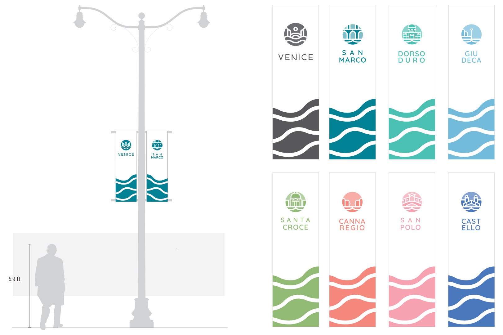
The objective of this project was to design a wayfinding system for the city of Venice located in the Veneto region of Italy. The city itself has a simple wayfinding system consisting of Signs that vary in colour and size. To that end, the revised design includes an expanded and unified system with colour coated districts, new iconography and new directories and banners. The new colour coated districts will feature heavily in the new designs, acting as accent colour for each sign.
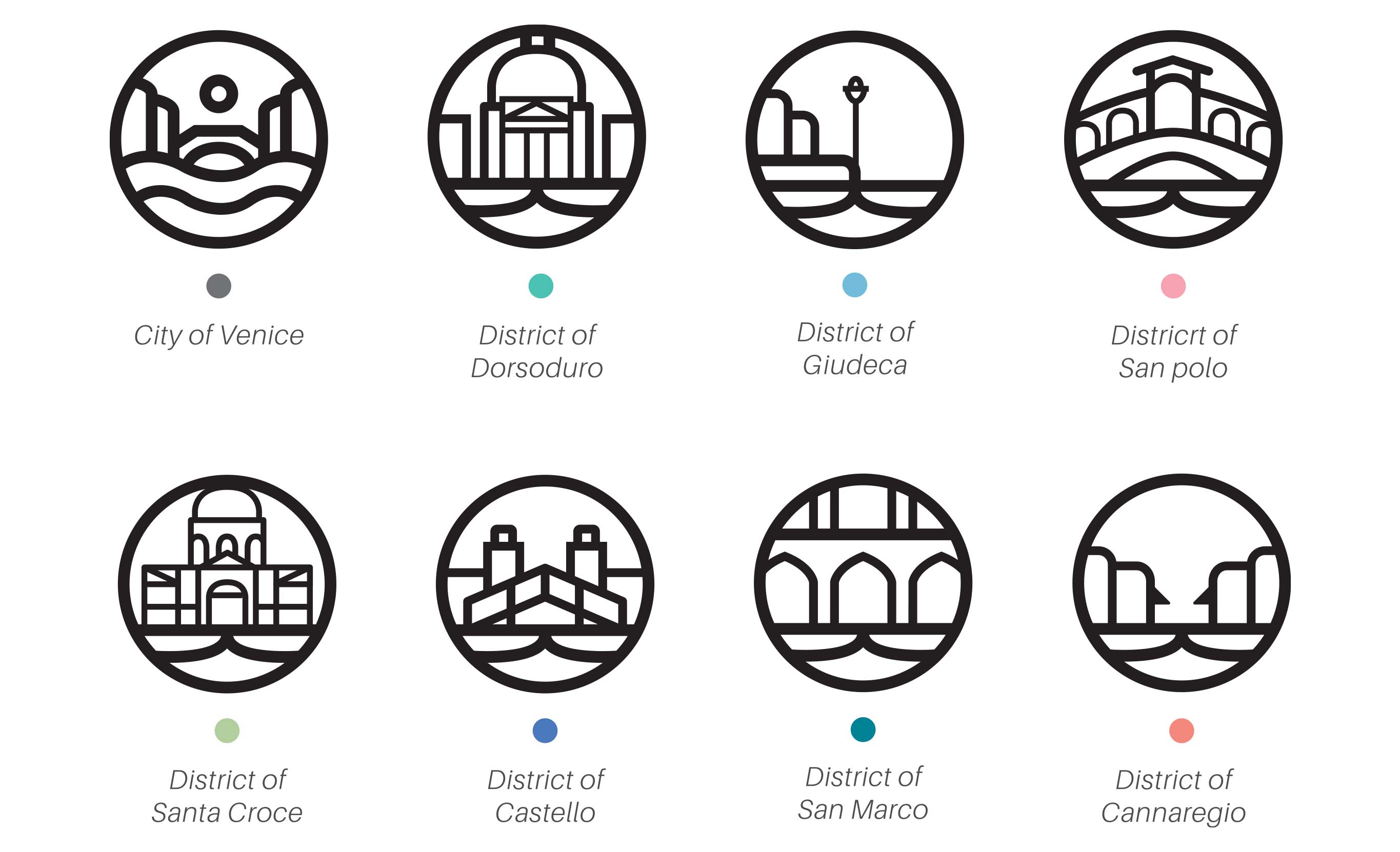
To help with the wayfinding of the city of Venice, a new system of organization was made in on top of the pre existing districts of the city. Each district is assigned a new accent colour swatch, along with a new symbol. The corresponding colours will act as a Accent colour on the new signage which not only be used to stick out more but to also display which district it is in.
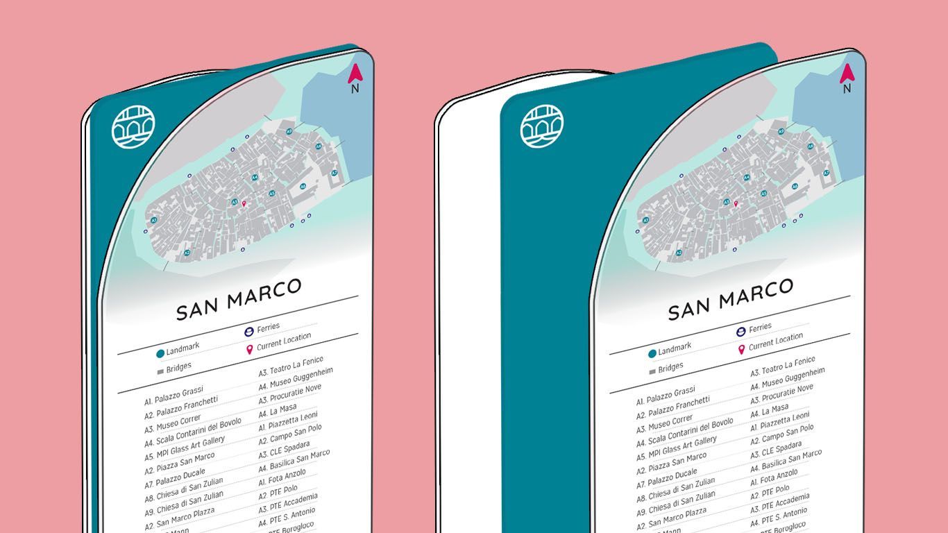
The signage was designed in a minimal yet modular fashion in order to not stick out in the streets and to allow ease when making repairs. Each sign is split into two to three layers, consisting of the outer layers where all the contents will be and the middle layer that shares the colour of the corresponding district. For the directory the outer layer will have a map of the whole city and the map of the corresponding district. The middle layer will be sandwiched by the two, and act as a marker contrasting the white outer layers while also being visible from the side.
The rest of the signs were designed mostly to be affixed on walls as most of Venice consist of narrow streets devoid of street posts to hang signs on. To that end, a larger directory was made in a similar fashion to the freestanding ones. The rest of the signs however were made to be sort of a homage and a replacement for the old ones, being made to match the rest of the wayfinding system. Unlike the other parts of the wayfinding system, the accent colour is used to be more of an arrow to point passerbys in the direction they need to go.


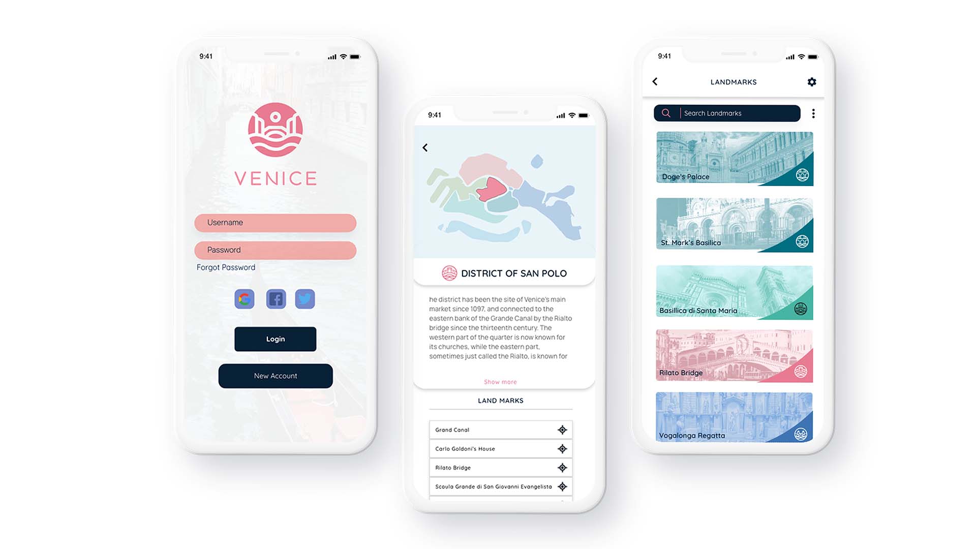
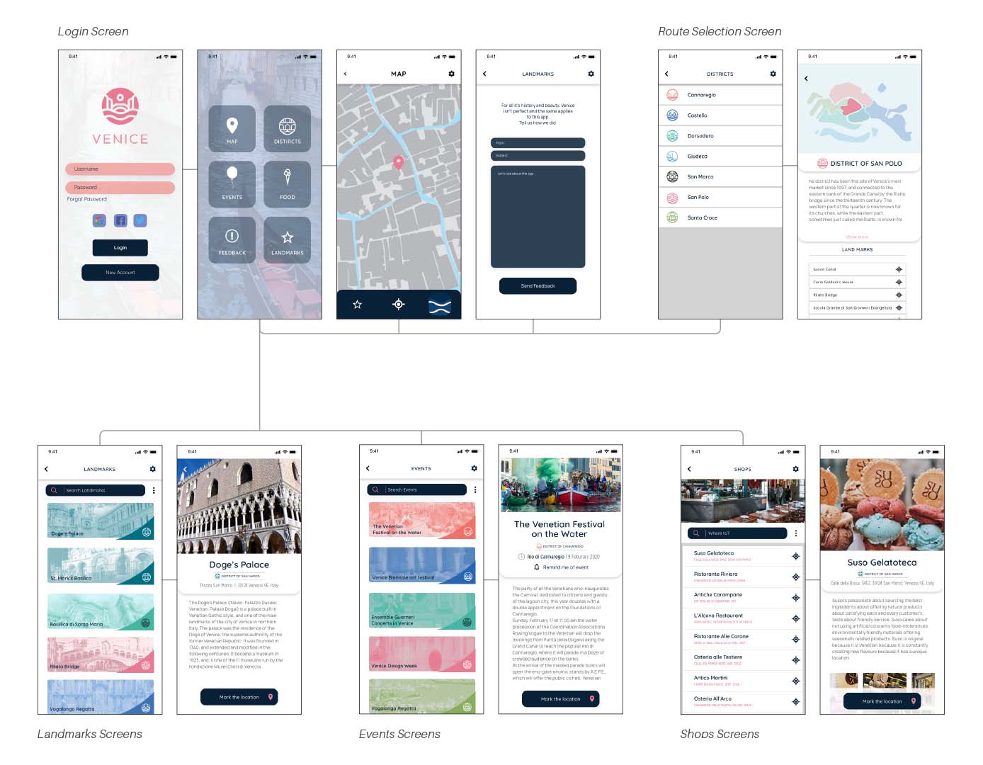
The app was designed to accompany the new wayfinding system and would be targeted towards tourists rather than locals. The city of Venice is known for being more labyrinthian then most modern days cities due to age of construction and non grid like structure. In accordance with this, the app contains features like maps, food locales, events and other things that would benefit any newcomer to the city. Since the app was designed together with the wayfinding system, it shares the same look and rules of the wayfinding system utilizing the same colours, fonts and motifs, with the use of duotone photos being its one difference.