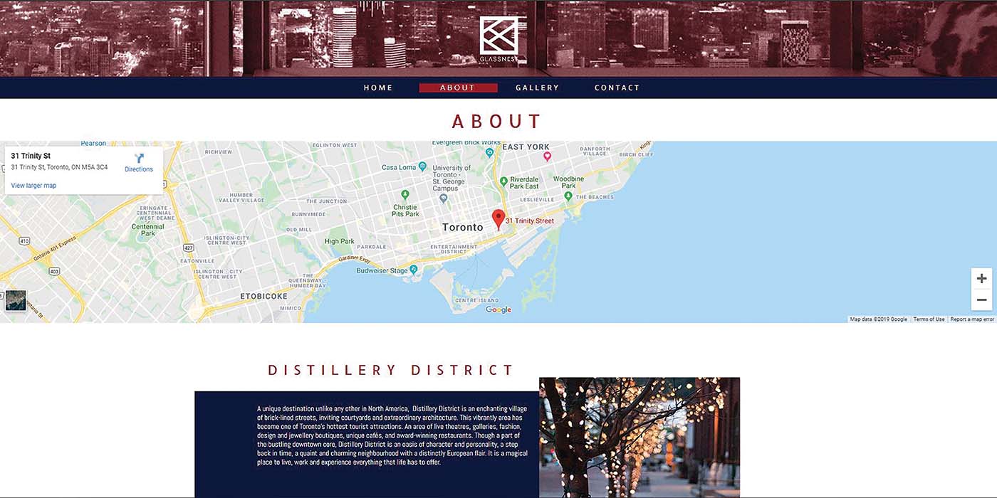
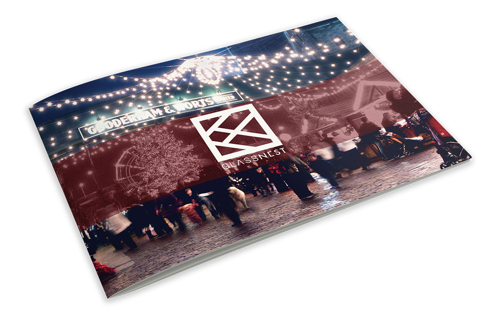
The goal of this project was to design a brand and corresponding documents from scratch for a Condo located in Toronto’s Distillery district. All materials for the condo follow a distinct set of rules, that being reoccurring maroon duotone rectangles that contrasted the clear and often dark and warm photography. This was all done in alignment to its sharp, spacious and contemporary style.


The name Glass Nest was chosen for it’s contrasting attributes; one being of the cold glass and steel the building is made of and the other being the warm and homely picture of a nest. To compliment this choice, the chosen colour palette was that of a maroon and dark blue, with there also being a pale blue to represent the windows. All in all, the reason everything was done they way it was, was solely due to the warm feeling the Distillery district inhibits through its brick and mortar.

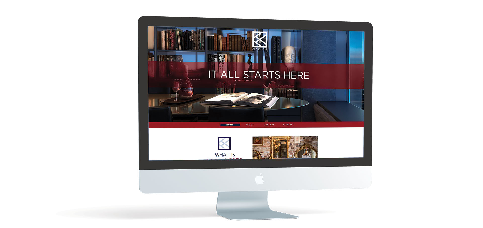
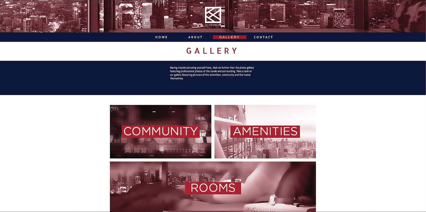
The direction that website headed in was the same as the brochure, advertisement and folder. It to had a white background and the same colour scheme with it’s differing point being the buttons. A select few buttons were designed be like windows, with it’s duotone off state acting like a blind, and it’s on state being a open clear window to the picture.