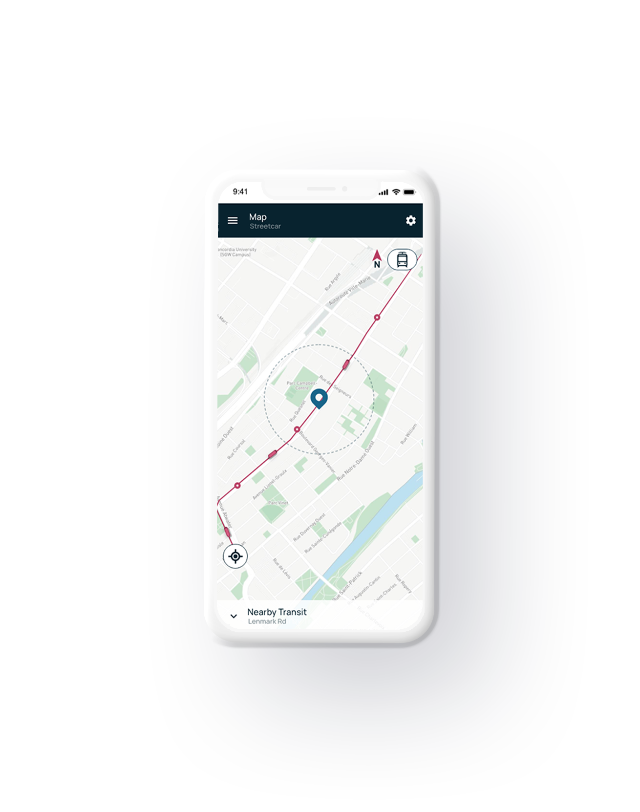
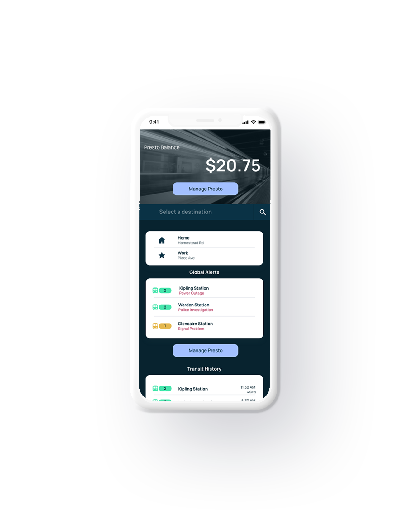
The purpose of this project was to develop a mock-up of a Transit app that would be used to traverse Toronto. The app uses a white and dark blue colour scheme to separate itself from similar apps and its previous iteration. White is usually used as a base for most information with Dark Blue being used for bars, search bars and text fields. The app itself takes inspiration from current trends found in other transit apps.